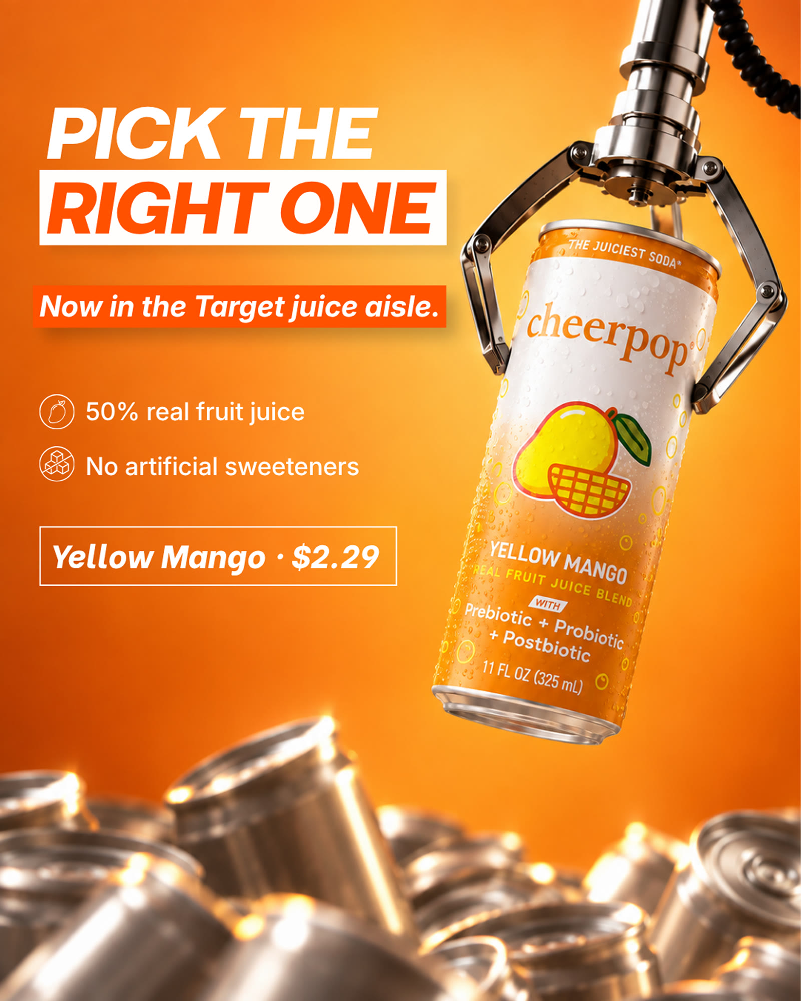
Cheerpop · creative market read
We opened all six of your live ads — every one of the fourteen pieces inside them — read four bigger drinks brands frame by frame, and then made you the ad. Thirteen seconds of it are one tap away.
Saahil, who runs Shaanks, on what we made for you. Thirty seconds.
01
Six ads are live. Inside them are fourteen separate pieces of creative — two films, two images and two carousels of five cards each. We opened all fourteen by hand rather than sampling them. One billboard artwork runs twice, so thirteen are distinct.
02
The hard part of a retail launch is getting a shopper to the right aisle, and your account does that well.
The second film is a shelf walk — a cart pushed down the juice aisle, the price tags legible at 2.49 and 8.49, a hand placing a four-pack in the basket — and it closes on five and a half seconds of full red end card: cheerpop® NATIONWIDE NOW · shop before it's gone! Between them, the arrival is fully told.
03
We read 130 frames across four accounts — Poppi 24, Olipop 20, Liquid Death 42, Vita Coco 44 — opening each one rather than reading its captions. Two are sodas, Poppi and Olipop. Liquid Death is canned water and Vita Coco is coconut water; each is here for one pattern it runs at scale.
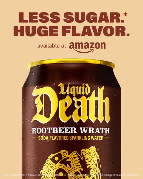
The headline is always a reason to want the can — a sugar number, a joke, a comparison. Where you can buy it sits underneath in small type. The ad refuses to be an announcement, so someone seeing it a third time still gets something new.
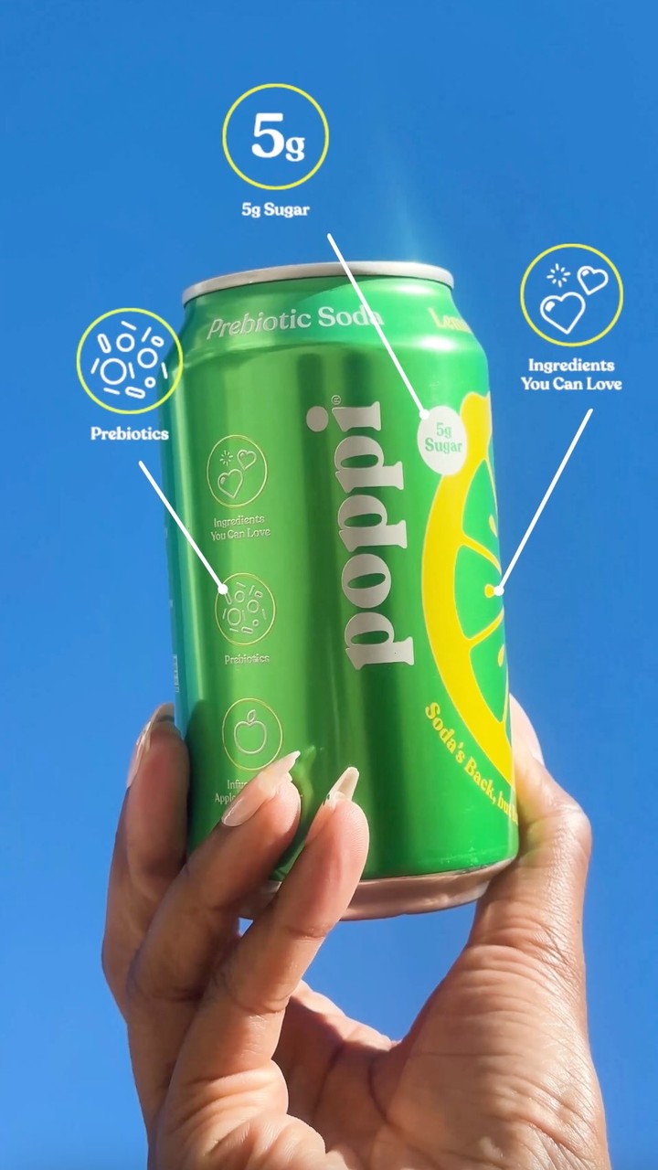
The same figure carries 15 of the 24 frames we read. It is not a claim you have to read a paragraph to understand — it is one number, printed large, in the same place, until it belongs to the brand.
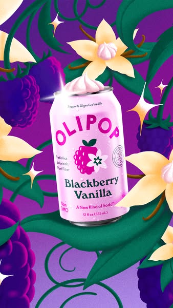
Never the lineup. One can, and the frame built out of the fruit inside it — blackberries and vanilla flowers, a bed of green apples. The flavour is the idea, not a label on a row of cans.
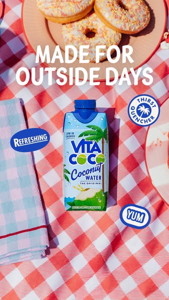
Outside days. The midday slump. A heatwave. Each ad picks an occasion, then builds the whole picture around it — the blanket, the donuts, the keyboard and the alarm clock. You are not sold a drink, you are sold a twenty-minute window.
04
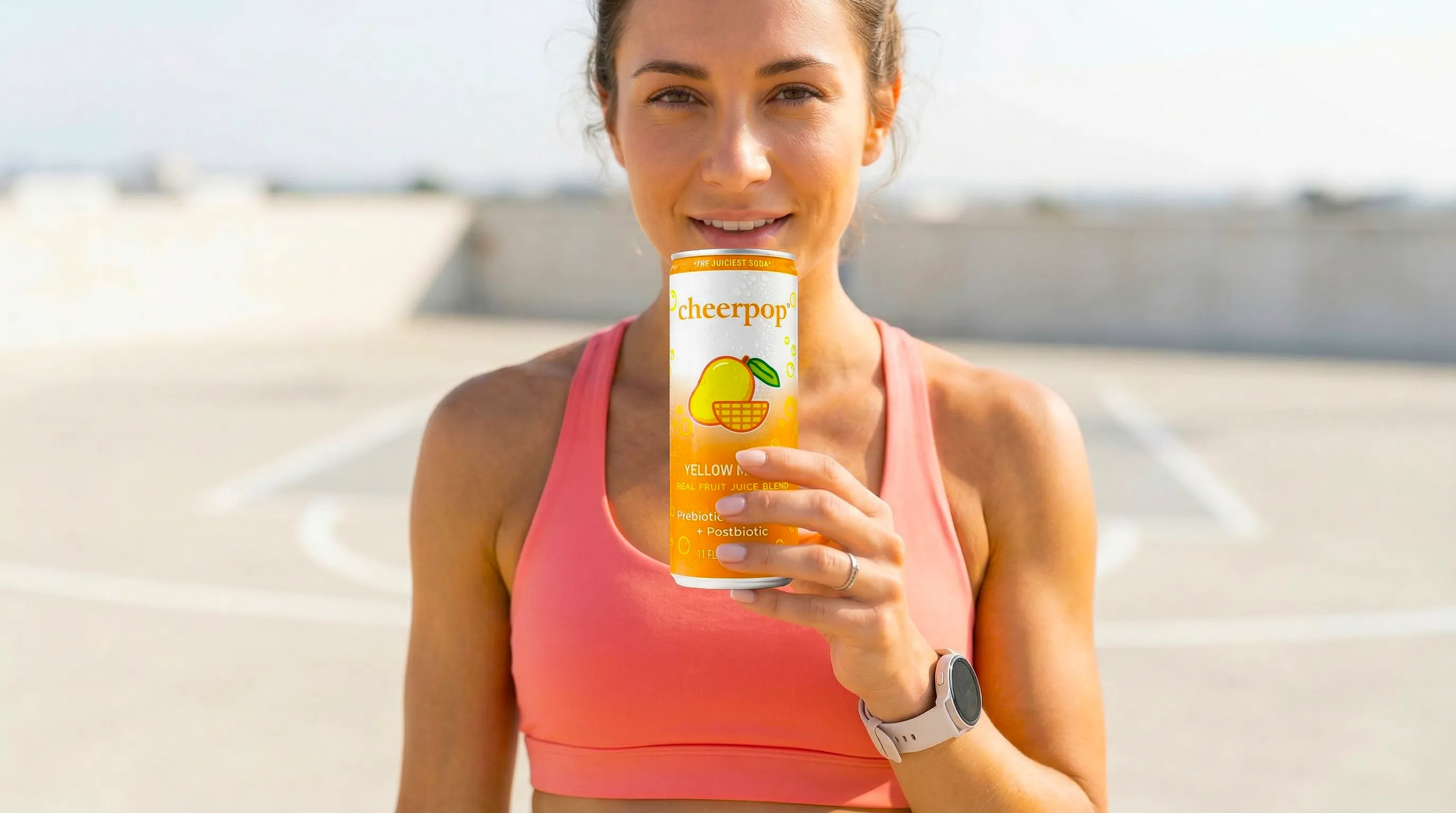
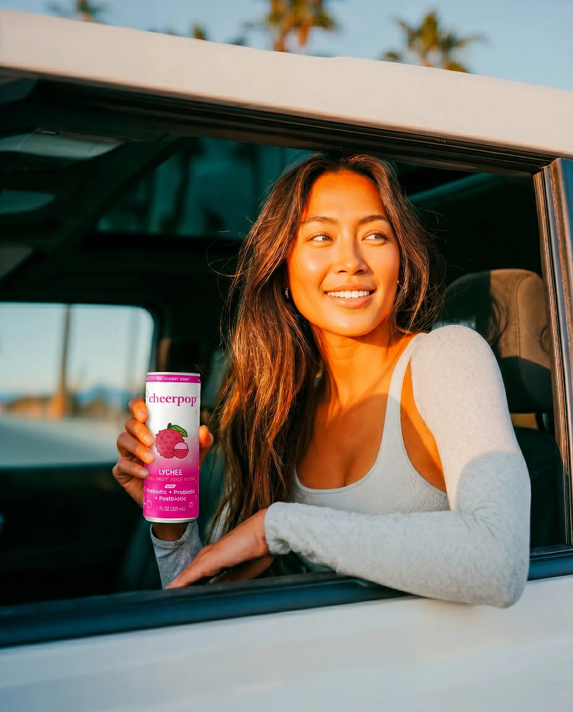
Pick a twenty-minute window — the car before work, the walk home, the afternoon slump — and build the whole picture around it, with the can in hand. It is the angle Vita Coco runs on 40 of the 44 frames we read.
Your can prints Prebiotic + Probiotic + Postbiotic, and it is legible in seven of your fourteen pieces. It has never been the point of an ad.
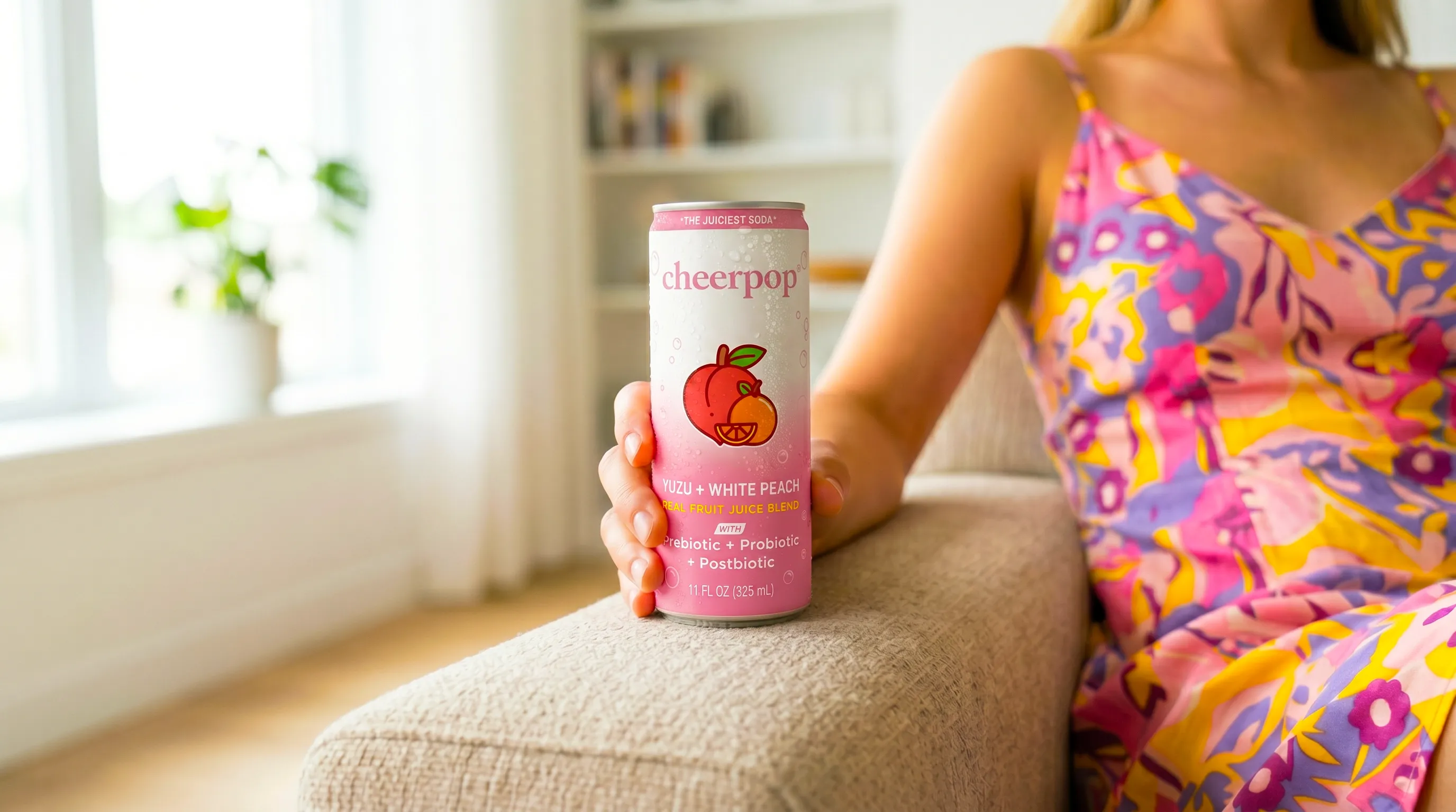
Lychee. Yellow Mango. Passion Fruit. One per ad, the fruit in frame, the taste described — instead of six cans in a row.
05
An AI commercial, made this week, for the digital feed. Thirteen seconds. It is a second angle, a moment instead of an announcement, and it still ends where your ads end: in the juice aisle at Target.
13 seconds · vertical 9:16 · made for Meta and TikTok placements.
Nothing about the arrival is lost. The Target line still lands — it just lands after a reason, the way Liquid Death runs Amazon on 21 of the 42 frames we read.
This is a first cut, made in a day to show you the idea rather than describe it. The next version is built on your can, your flavour, your shot list.
06
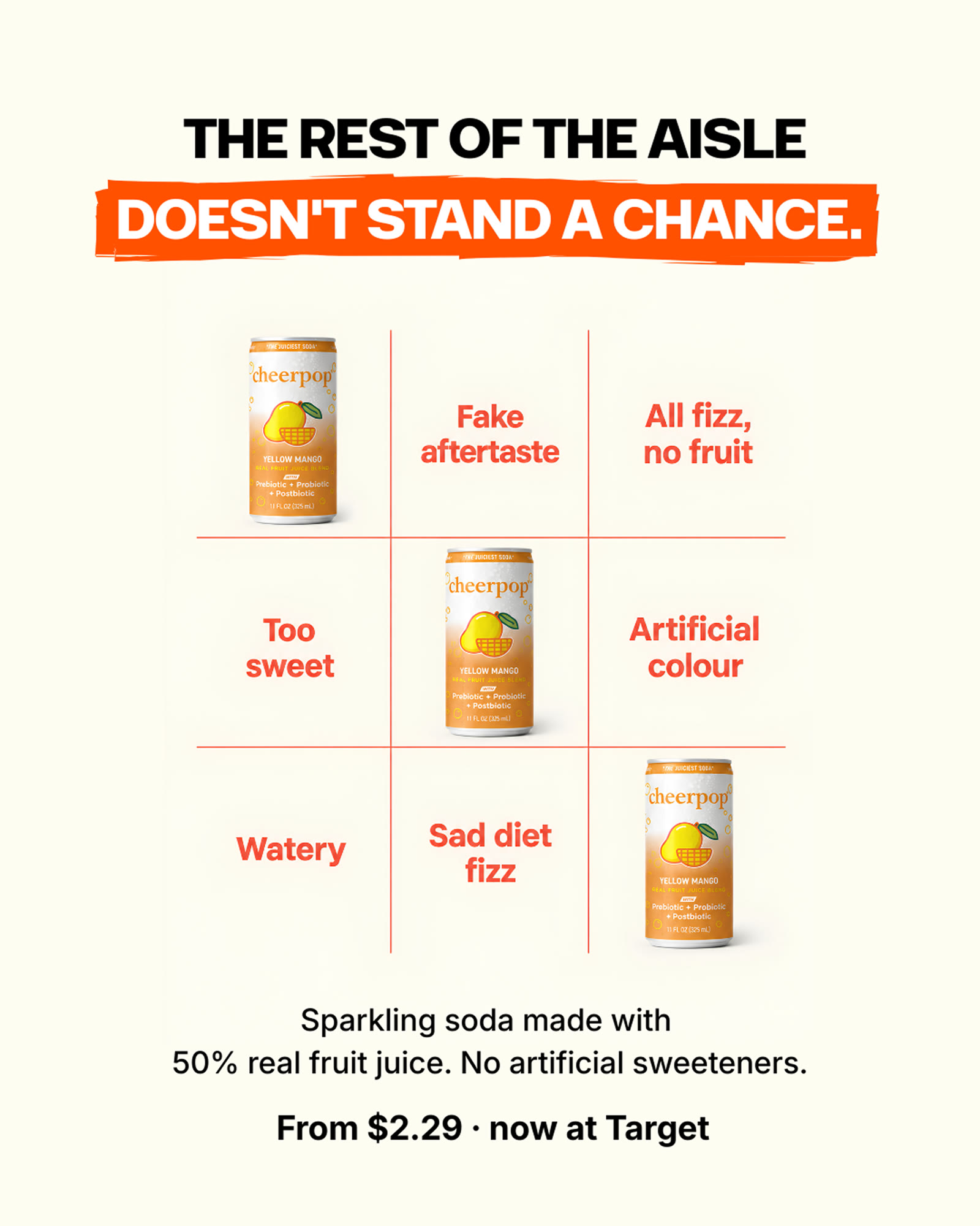
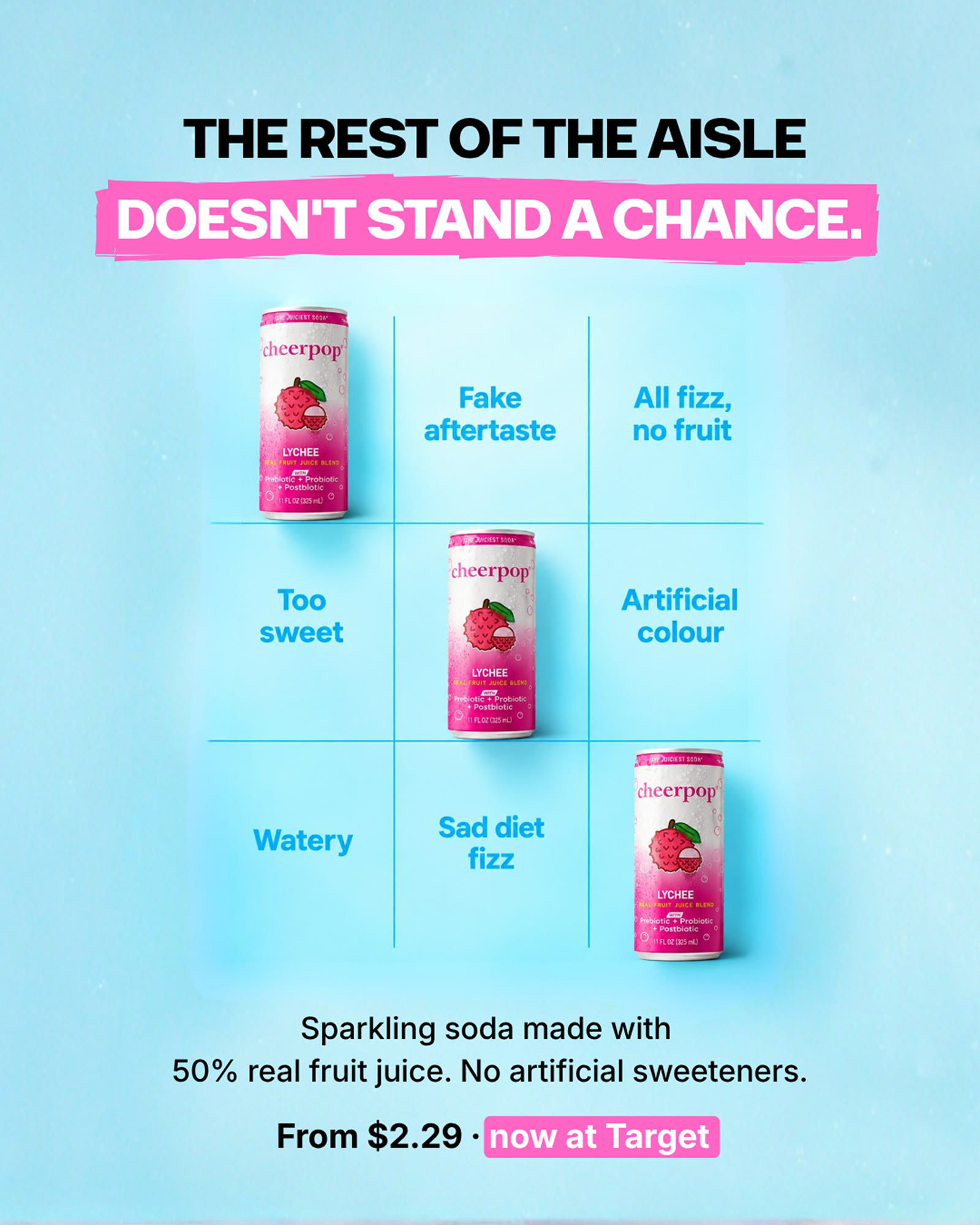
Not directions. Finished ads, with the words that run around them in the feed.
Swipe: Yellow Mango, then Lychee. Same grid, one flavour per card.
One flavour, one can, lifted out of a pile of blank ones.
Or just reply to my DM with a time that suits you.
See the work behind this